

About vergelijker.net
Vergelijker.net is a Dutch platform that compares insurances in all sorts and sizes. The company approached Ten Hacken Online to transform their website with a new branding including their logo.
Vergelijker.net logo design
The logo is based on a User Interface (UI) element known as the ‘toggle’. Why did we choose for a toggle? Using a toggle as a UI element is intuitive, simply click and it shows the ‘activation’ of your request. Finding an online insurance should be just that; easy, intuitive and fast.
Website development
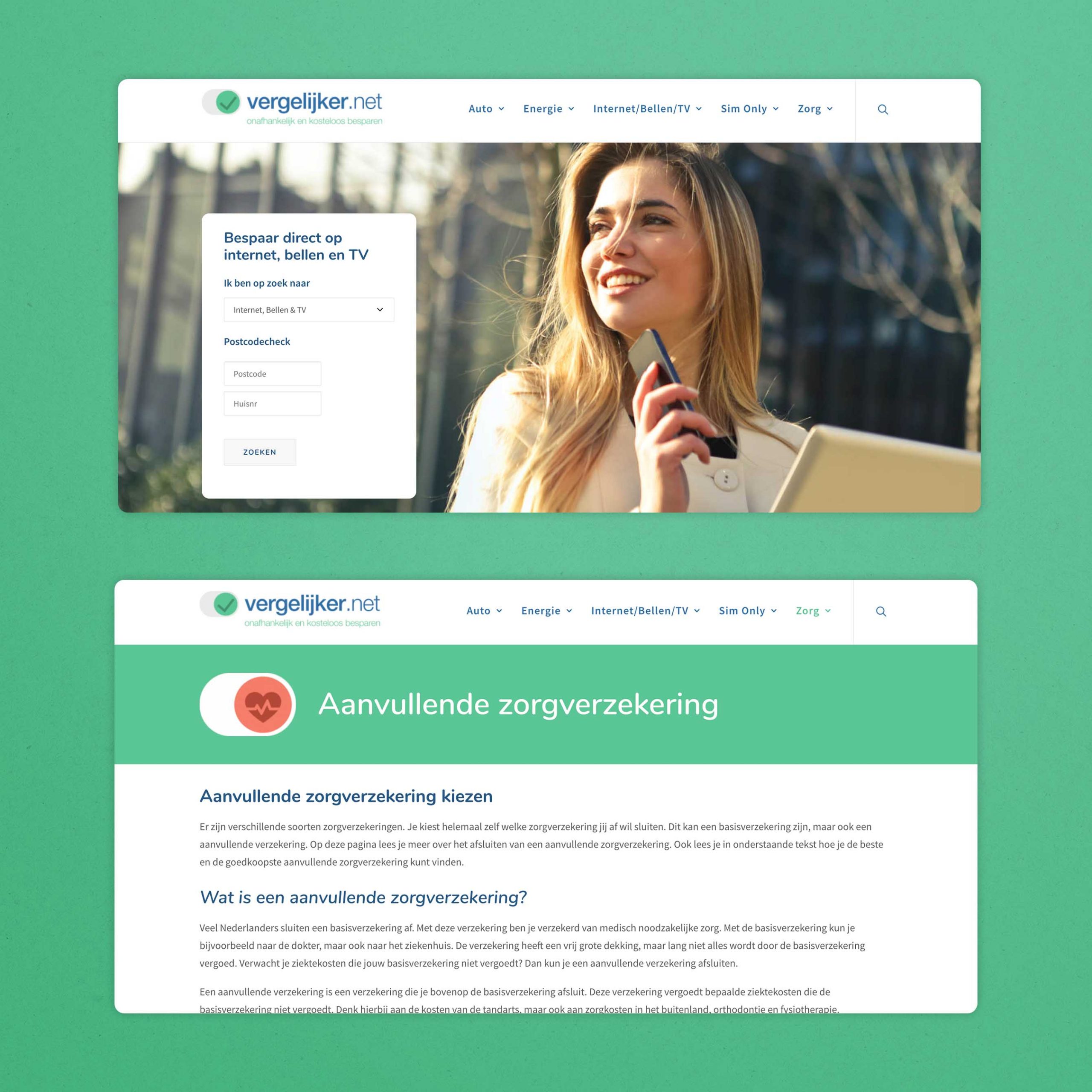
We created personas and walked through mock-ups of the websites together with the client. This provided insight in the process of comparing and purchasing an insurance online, helping to understand the desired behaviour.
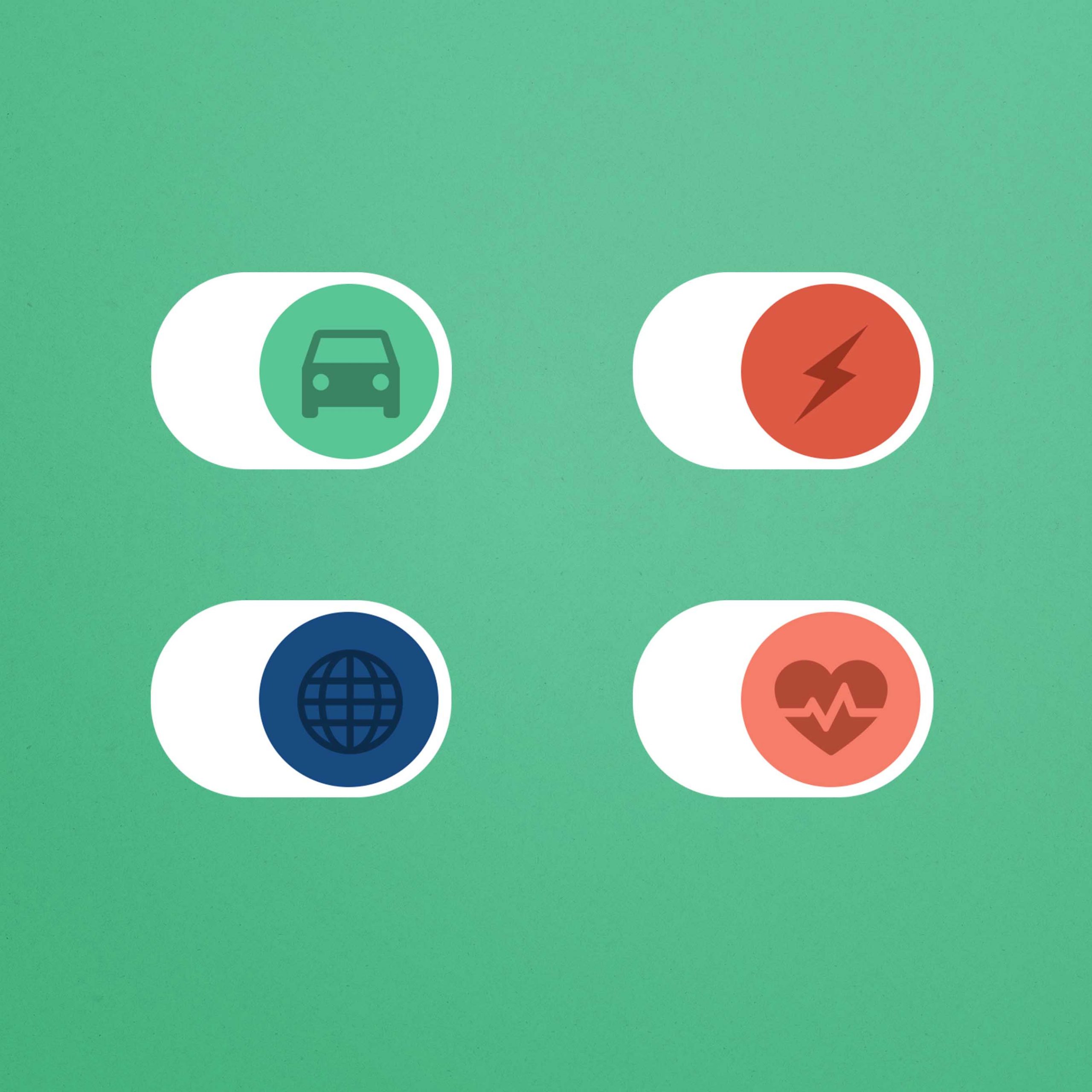
Based on these outcomes, we continued the development of the website. When a visitor lands on the page, they can immediately search for a specific insurance by providing their postal code. Scrolling down will provide an overview of icons that bring you to specific insurance types such as health, car and energy. We developed the icons based on the logo and gave them their own twist.